Since settling in, I'm especially starting to rethink wall color.
At heart, I'm a post modern/contemporary/mid-century sort of girl. Since fulfilling my life long desire for a bright red room, most recently, in my last space--I'd link to the posts in this blog that chronicled the painstaking painting of my erstwhile family room bright "Daredevil" red, but I'm at the moment too lazy to look them up. Anyway, having fulfilled that particular paint dream, I'm now leaning toward greens, browns, and grays. Neutrals, basically. As far as the walls go.
My whole space here, every single room, is painted a light buttery yellow. It's a very nice color, and actually works with everything, but it's been this way for a while now and I'm ready for a change.
I'm spending more and more time in my home office these days and this, I decide, will be my starting point. There's not a whole lot of stuff in that space at the moment, unless you count my SUPER cluttered desk, well, table actually, and a couple of two-shelf bookcases. Still, one thing does dominate the space.
And that is my Nighthawks print.

I figure there are way worse choices for color inspiration than the work of Edward Hopper. I don't know, I just feel like maybe he has it all figured out. So, I've decided to use the print as my starting point. It's true that there is a substantial range of yellow hues represented--both butters and saffrons--in the work, but I will focus on the greens and reds. The bottle greens and sages coupled with the shades of cinnamon and brick. Luscious and spicy. Rich and comforting. Yum. And maybe sprinkle in a few yellows.
According to my color/mood research, green is the color most often linked psychologically with creativity, and for this reason, I will choose this hue for the walls. Being the anal/retentive over-thinking creature that I am, I've spent a criminal amount of time at the Behr website perusing their huge catalog of color choices and in person at Home Depot doing the same.
The choice? After way too much dithering: Laurel Mist.

Behr has done a great job of locking down photographs of their colors. Pictured above is the paint chip. Laurel Mist is the most saturated color at the bottom. I consider it a gray/green. It has a sort of a dull velvety quality. Very rich. But still sort of a neutral. It doesn't scream HOLY SH!T GREEN! More like ahhh....greeeeeen. In dark light, it could easily read gray, I think.
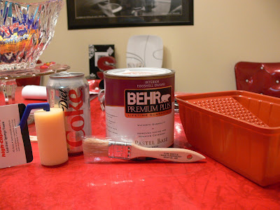
Still. I am taking no chances. I want nothing less than the perfect shade of velvety neutral green(ish gray). I've had a few paint disasters and there is nothing worse. So I purchased a tiny can of Laurel Mist and a few tiny paint supplies with which to paint a test patch on the office wall.
Can't sneak it passed you, can I?
That's right. More tiny, baby. It's still there! The rogue fascination with The Tiny! What? Like I'm gonna walk away from a selection of tiny paint brushes and tiny rollers? Me? Sorta doubt it. Check it:
How cute is all that tiny stuff? Tiny roller! Tiny paint brush! Tiny paint can! Doncha just wanna pinch it's itsy widdle cheeks?
Okay, back to business. Here's the yellow wall before:

And here it is after the (okay, sort of large) test patch:

LOVE it! Love. Love, completely. Yes. And you? Yes?
And so it was on to what is, by far, the most exciting portion of the project. You aren't going to believe it when I tell you. I bought...CURTAINS! Wee!
Now, I suppose I sound a little over-excited about purchasing curtains. But, understand. I haven't bought curtains in THIRTEEN YEARS, people. That's right. The Ex-Man was totally opposed to curtains. Curtains were Big No-No. Curtains? Bad. Blinds? Good. I don't know why. It's just one of the many preconceived deeply held notions that I had to live with. Not that I don't have any of my own. It's just that all of mine? Make sense. But when co-habitating with, um, you-know-who himself? You pick your battles. Suffice it to say curtains just weren't one of those things I was ready to don my chain mail, grab my mace, and face-off at the Coliseum over. No, I saved those encounters for the big issues like, oh, I don't know, let's see...THROW AWAY YOUR JUNK MAIL BEFORE I CHOKE THE LIFE OUT OF YOU!
Okay, deep breaths...in...out...in...out. Ah. Better.
But now....NOW? It's, bada boom-bada bing...CURTAIN TIME! That's right! Can't touch this! Bring on the fabric panel window coverings!
Now, understand me, I'm not a huge fan of elaborate, formal, foofy, over-styled curtains at every window. Not hardly. Far from it, in fact. It's just that NEVER any curtains? For 13 years? Is a reeeally long time to go without something fluttering in the breeze by your window panes.
So...behold. My first curtain purchase in over a decade:

What's not to like about those? I ask you? Who among us can resist the lure of the rich spicy color? Certainly not me. Also, tab tops! Woo!
(To Be Continued...)


2 comments:
LOVE that paint color!
Way to go. I didn't know you were decorating. Doesn't it feel good?
Post a Comment